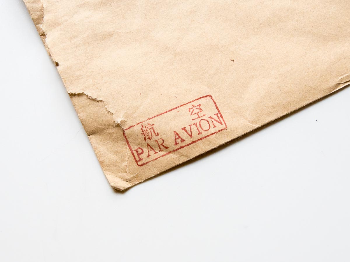
There are two things attracted us immediately when we received the mail post from coco.
One was the seal ‘航空 PAR AVION’, it’s so good looking. We’ve only seen the blue sticker with ‘AIR MAIL’. It’s just not comparable with the red seal on the kraft paper. Chinese with French in great typeface, super. Just beautiful.
Two was the bird stamp. We’ve never seen this species. We couldn’t find it on Bird of Europe published by Princeton. So we went for A Field Guide to the Birds of China. And we got it! It’s 贺兰山红尾鸲 / Alashan Redstart / Phoenicurus alaschanicus, a bird endemic to northern and western China. According to Wikipedia, another name is Przhevalsky’s Redstart, indicating it was discovered by Russian geographer Nikolay Przhevalsky. We got many Codirosso / Common Redstart / Phoenicurus phoenicurus here, who is a migratory bird coming here every spring-summer, from Africa.
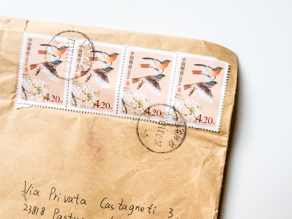
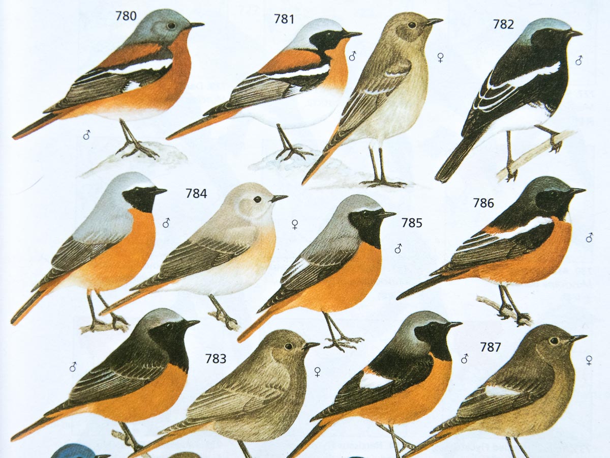
Winter time comes eight special Redstarts from Ala shan, so fascinating.
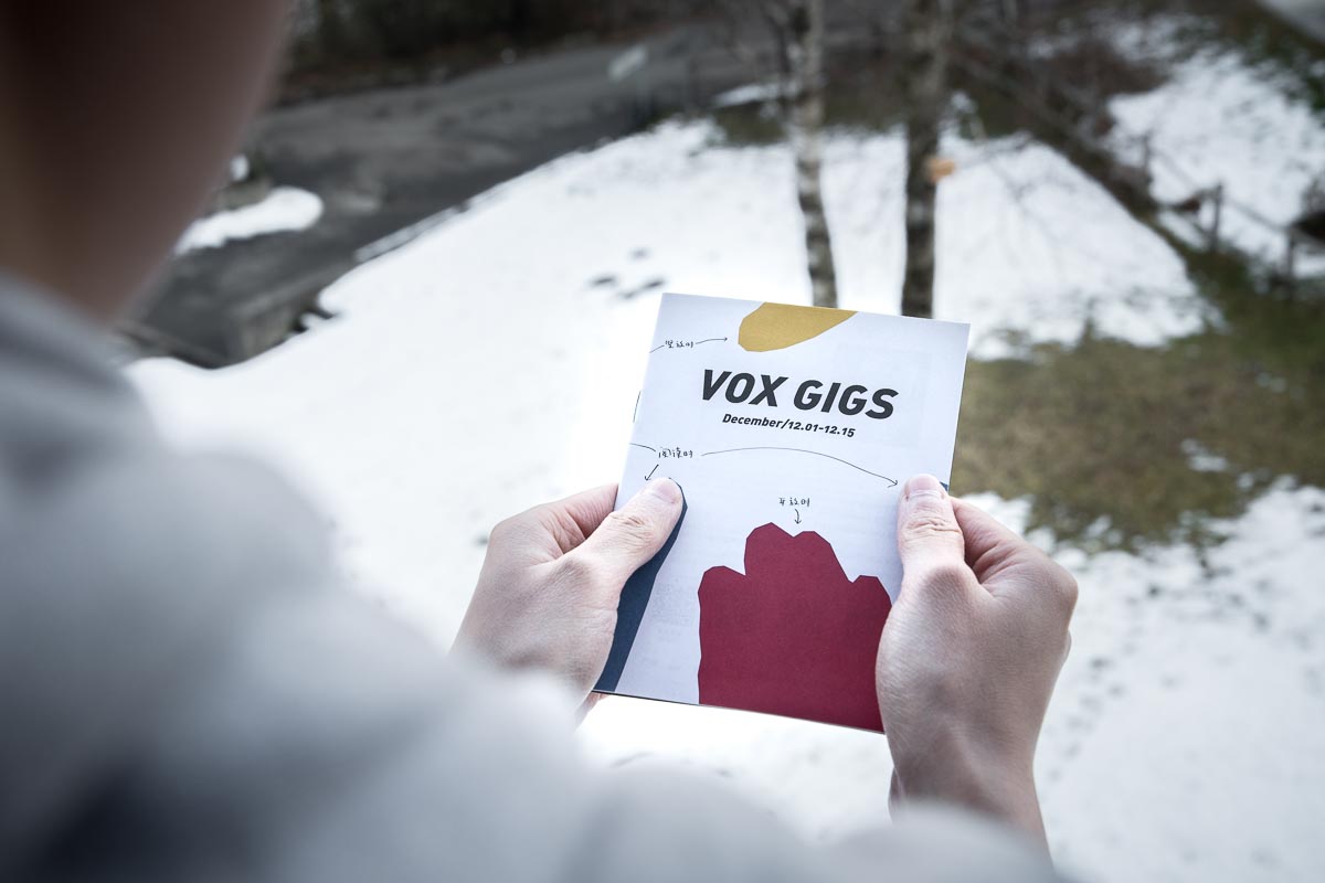
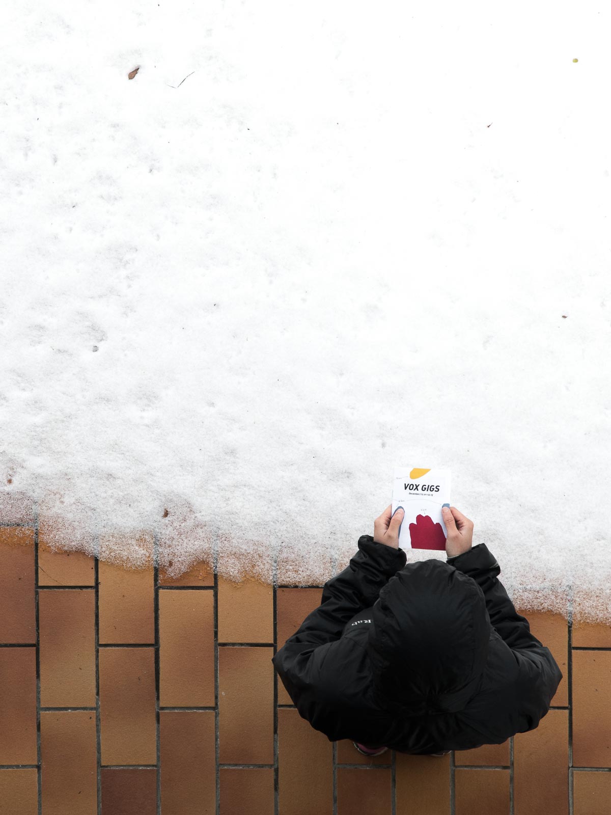
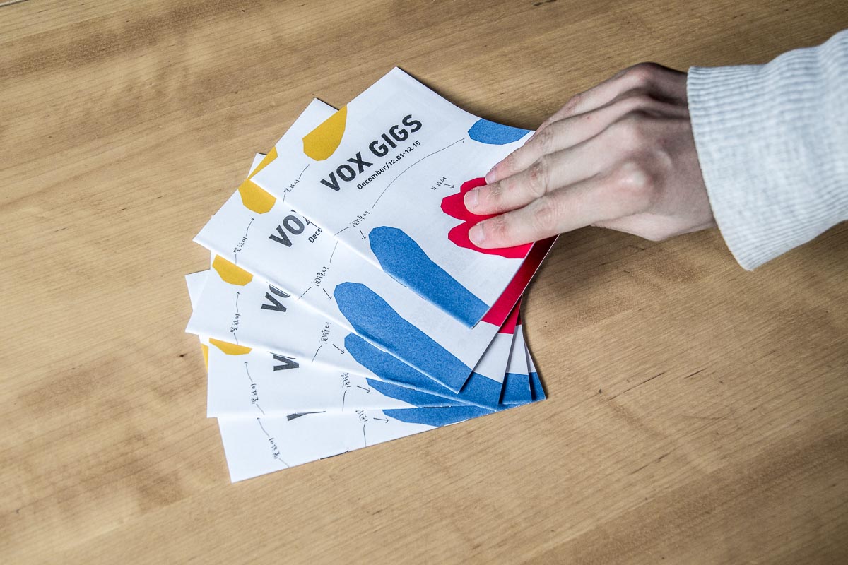
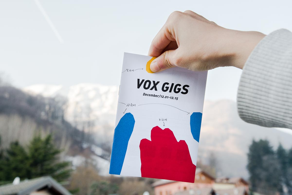
Inside the envelope, there were vox gigs (Dec. 2017), that coco mailed to us from Wuhan, China.
She mailed to us because we designed the cover.
Coco invited us to draw it in October 2017, showing us some previous issues as example. Nice ones. “Everything is up to you.” She said, “But you can make something inspired by the current season as well.”
We felt we can do it, so we said yes. A few days later we went for a walk to Artavaggio, because we got to pay off 20€ to Rifugio Nicola. Why? Because last time we went there we only brought some British pounds, and Walter, the owner said: Alla prossima volta! (Next time!). So it was another five hours walk, go and return.
We discussed the cover on the way.
Yoko: Let’s draw a Gallo Forcello (Black grouse)! It’s here in the winter. Paper is white, like snow, Gallo Forcello in the middle, is like standing in snow. It shows where we are and brings winter atmosphere.
Tao: Why not make something more designed, because previous covers were all paintings, we are more design.
Then we talked like our everyday discussion on design: what’s the function of brochure, what’s the function of cover, what’s the relationship between people and the brochure, so on and so forth.
We used to take a huge amount of this kind of brochure. Every cultural institutions prints them. We took them whenever we see, to understand what shows and exhibitions do we have in the following days/months. However we saw them no more than once, and threw away together with the other maybe never opened ones.
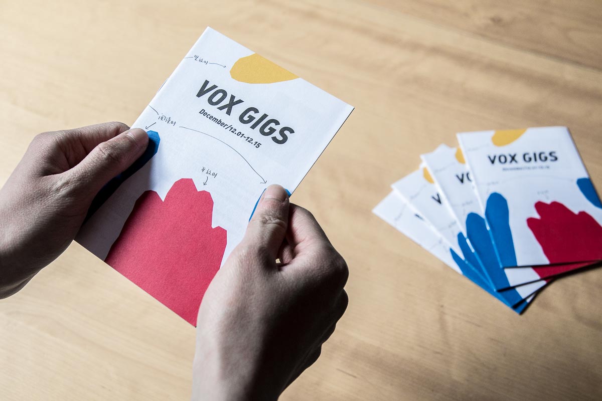
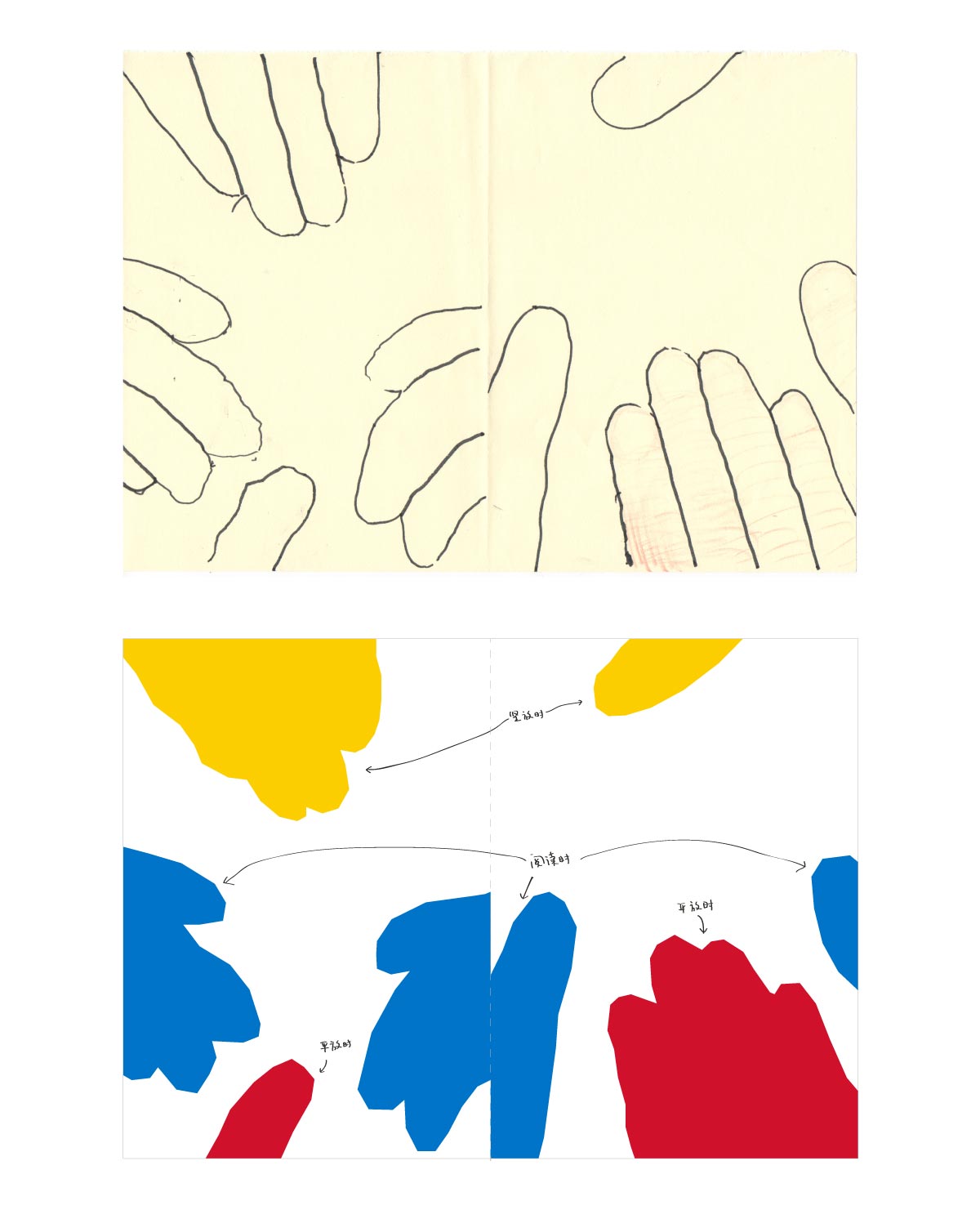
Can we possibly do something on the cover, so people would like to really read and see and hold it for a longer moment? How about we draw different positions of hands on the cover, presenting different moment you hold the brochure, so you would feel more attach to it?
Tao then started to trace his hand on paper when we back home. Then we scanned into computer and coloured same moment’s hands with the same colour. Done.
We felt good about it so we dropped off the Gallo Forcello idea.
But of course, maybe Gallo Forcello can be even better.