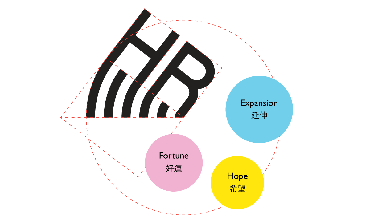
We designed the logo of a Canadian trading company belongs to Yoko’s old best and best old friend.
Having strong interest in art and design, our client learnt painting in her childhood, dreamed of becoming a fashion designer later on, and applied for architecture school of McGill university. However, instead of ending up as an artist or designer, she is more like a geek now, holding double degree in Mathematics and Economics. Last year, she set up her own business, a trading company focusing on electric-related products. At the beginning, she was too busy to go through branding issues. As long as she felt uncomfortable to move further without a formal logo, she asked us whether we had time to deal with this.
We got the most important message very early—Hundreds Rivers, a phrase appealing to her so much. She had thought to make it the name of the company but gave up afterwards while still kept it in an abbreviated form, H.R.. “I want to express Expansion (延伸), Hope (希望) and Fortune(好运).” She told us.

In our meetings on every Friday, we got her feedback on the revision sent to her two days ahead since decisions may need time to be made. It does not ask for constant attention but quick look several times per day. First two weeks passed, rounds of brainstorming left us various directions and drafts. Decision making time was due! Finally, lines merging with two capital letters, H and R, won. Grounded on this, more ideas were worked out. Thanks to her practical thinking and good instinct, ideas coming from the client were quite inspiring. Even, acting as a trained designer, she once drove us to a new landscape (see below) where we got the final proposal. A milestone indeed.

