“What do you think you are looking at?” We asked friends and colleagues with the picture on the right. Paper-cut? Red envelope? Package for Spring Festival gift? Wedding invitation? None of them really got the answer we had expected to hear—the Chinese character Fú (福) on the door of every family, a traditional way of celebrating Spring Festival. We were shocked about this since we were so confident that nobody would misunderstood it. It urged us to review our design strategy completely, which brought us our second proposal. —Now, it would be good to talk about the things that happened prior to this very moment.
CPAD (the State Council Leading Group Office for Poverty Alleviation and Development) (oops…) in China held two competitions for selecting the best logo and poster for the first National Poverty Alleviation Day on October 17th. Though the commissions were published as two, which means logo and poster could be two totally non-related designs, we still decided to do an integrated visual identity proposal where the twos could have some synergy.
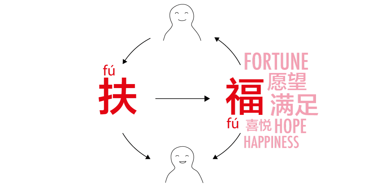
Main strategy: Fú brings Fú (扶,即是福)
扶 (Fú) and 福 (Fú) are two characters with different meaning but the same pronunciation Fú. The former one, verb, literally means giving hand to let somebody stand still or stand up. Together with other characters, it could express help in a general sense; the later one is a noun, meaning happiness but in a more profound way. It connotes dozens of positive things like fortune, happiness, hope, luck, and so on. Chinese people love it a lot, therefore they put it everywhere in words and visual identities having their names pronounced the same way as 福 (Fú). Inspired by this, we got our message to convey: Giving a hand brings happiness. In Chinese, it becomes Fú is Fú (扶,即是福).
As you may know, in China, poverty alleviation used to mean a kind of pure altruism untouched by any self-interest. It served as an important role in political propaganda and worked well in the totalitarian past. Once being given a little more individual freedom, people soon became not that comfortable with the narrative.
I am just a normal person. I am not a saint. It is non of my business.
Voluntariness did not work anymore and it was the time quota donation took effect. When it is necessary, companies would be requested a number of donation by the government, then companies collect donation from all the workers in a certain way. It is like you pay a bill that derives neither from any future welfare nor from your willingness. Money has been collected, empathy of people towards those who need help deadly decreases. The whole poverty alleviation thing was simplified to a small duty: Money paid, things done.
The goal of National Poverty Alleviation Day is encouraging public awareness. It partially proves that CPAD also realised the damaging effect of their quota strategy. So, they decided to rebuild an inclusive image by replacing the unspoken “request” with “invite”.
We personally had confidence in the new strategy but still felt necessary to find a meaningful way to communicate with people other than just saying “hey, welcome, join us!” Thinking from prospects’ mind, we soon realised people tend to be interested in knowing how they could take benefit from doing a certain thing. In our case, what is it? Here is the answer:
- Helping the others is not just giving out things while getting nothing back.
- Human empathy gives birth to happiness, enrichment, warmth and hope.
- They flow back and forth, nurturing both parties in a deep way.
It becomes Giving a hand (扶/Fú) brings Happiness (福/Fú).
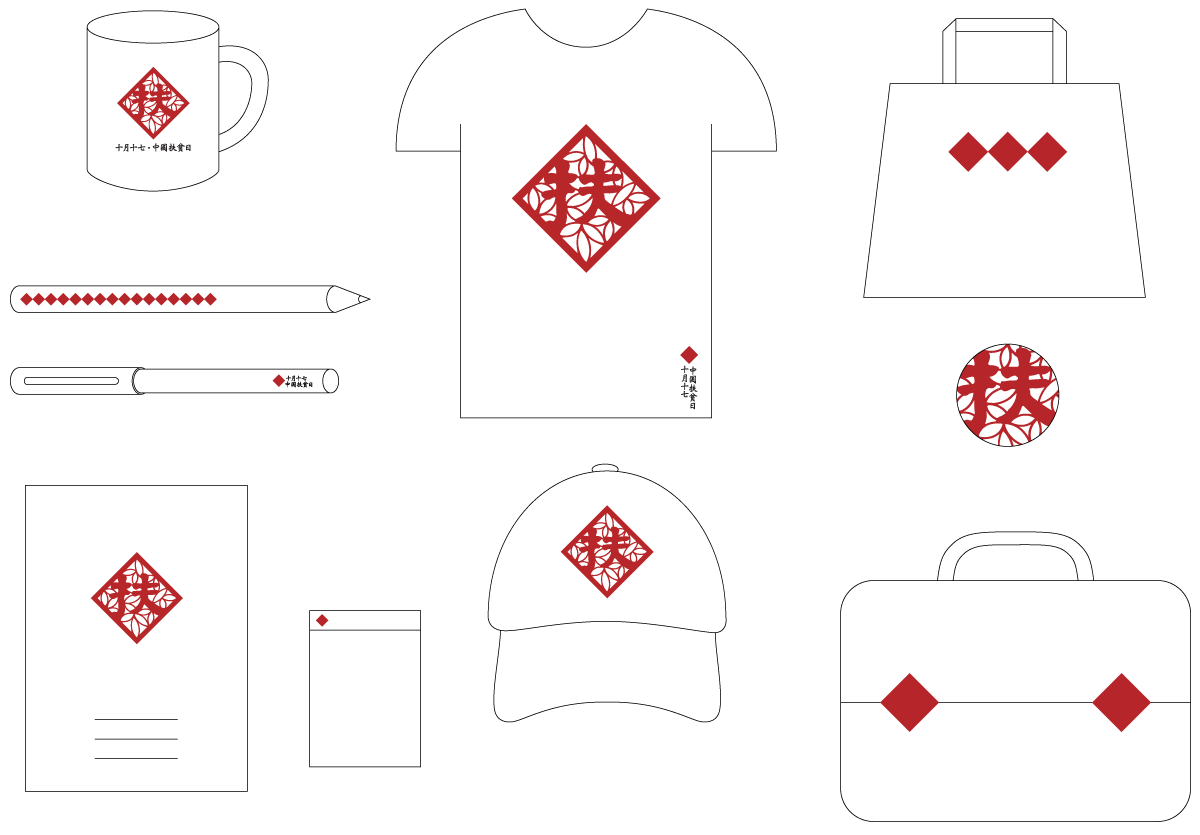
Visualisation: Red rhombus
We put the give-a-hand Fú (扶) into a red rhombus to imitate the red rhombus with the happiness Fú (福), appearing at the entrance of everybody’s home during Spring Festival. Under the assumption that the mounted Chinese character Fú (福) has already been carved into every Chinese’s mind, we got visual and sound connections working at the same time, which was supposed to convey the message effectively.
And it is so versatile to apply to any kind of product:
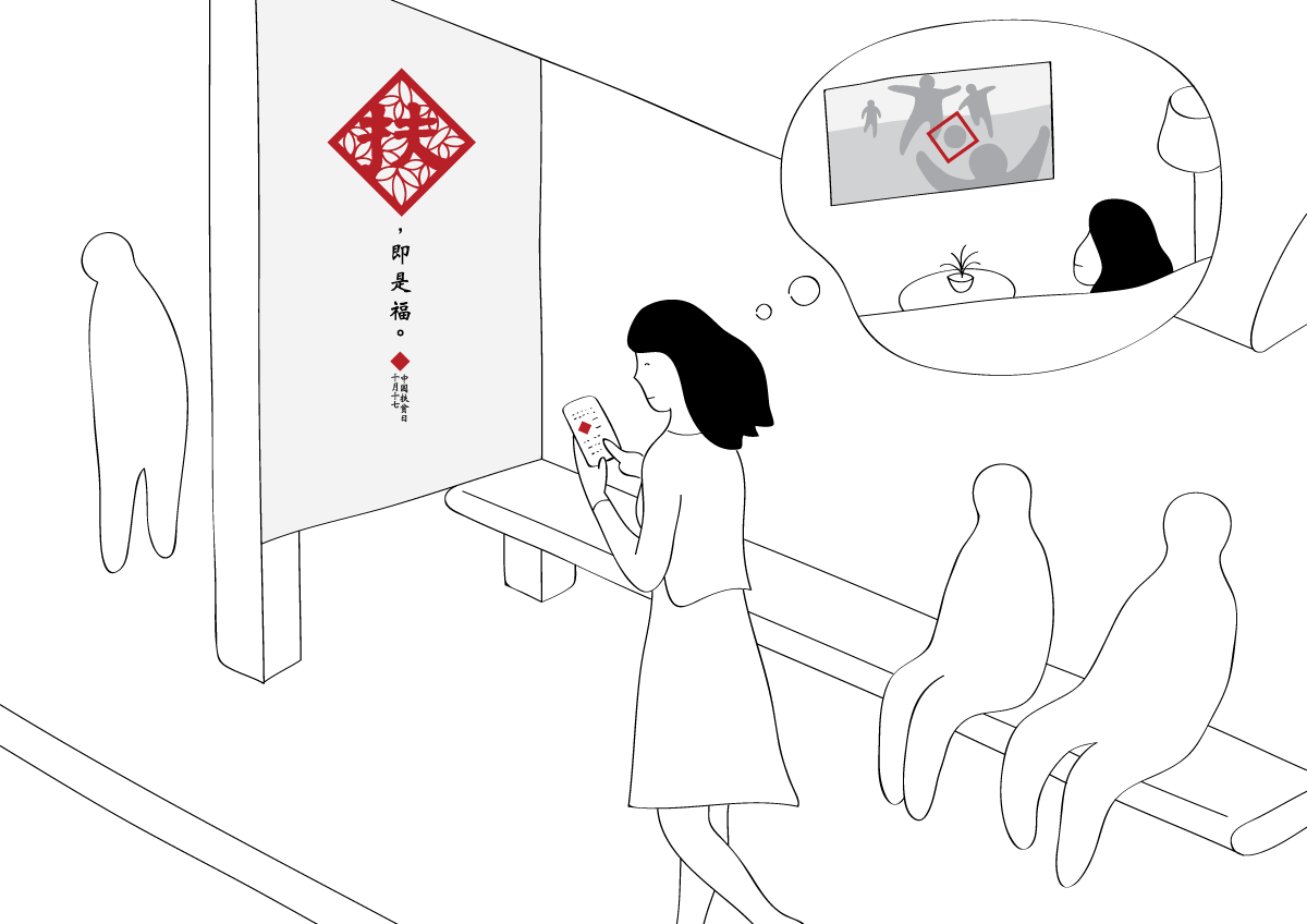
A series of posters
We made a series of posters with different dominated elements: word, graphic, and photograph. Accordingly, the abstraction level varies with word the highest, photograph the least, and graphics in the middle. First of all, it suits the different comprehension of people. Kids are more likely to be attracted by graphics while other people may find words more profound. Secondly, the series contains heterogeneity at low level that attracts people without losing the strength of the main idea as a whole.


However…
From those feedback, we got to know that without any clue of context people understood the logo in completely different ways (in the picture shown below, you can see that several other Chinese characters are all in red rhombus including the first happiness Fú); with words, people find the logo comprehensive, strong and well fit the context; after being told “giving a hand brings happiness”, they replied “Aha!”, “Yes, that’s it.” or “So cool!”. Then the question became whether the logo in itself should be able to tell giving a hand brings happiness. If not, logo+text is still a comprehensive, eye-catching, and context-relative one. Moreover, we had the scenario that posters would be the medium carrying the message, drawing people’s attention and, if it works, encouraging awareness. Technically speaking, posters could be a better carrier, thanks to its rich possibilities of expression.
Before being clear about this, we were quite panic, thinking of throwing away completely the old stuffs as well as making something new. It was the very end of a lunchtime, we talked loosely about making a new logo in considering all the feedback. Yoko said she wanted to try once more. We still kept using single character as logo, but used only the give-a-hand Fú (扶). Being released from carrying other messages, the logo became super straightforward that nobody would misunderstand it anymore. Bird—wings, flying, hope. Let’s try birds.
After completing the new one, we tested it on the same group of family members and friends. Interesting enough, those who had disliked the red rhombus liked the birds a lot; those who had appreciated the red rhombus were firmly anchored and just cannot accept the other ideas anymore.
The result? Birds won.