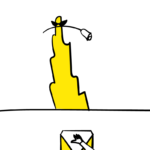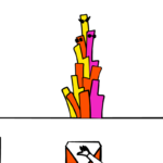
In his 30s, our artist friend CK asked us to design his apartment. In our near 30s, together with his new media studio, we did an illuminated tower in Wuhan.
Surely, at the beginning, nobody knew there would be a tower.
Why tower?
New World Department Store wanted to open a temporary market in its entrance square. It was supposed to last three months. People could meet, eat, buy things, join workshops or events there. The stands would be designed by a local architecture studio. Network Party was invited to do a landmark in the central piazza of the market.
The market would be open from morning till late night, so the landmark has to maintain its landmark value with light both off and on. It seemed that we could take care of its day-time performance, creating an impressive body and making it go harmonious with the site. Network Party would focus on new media part, including lighting itself and the interactive program. They could then tell us any special need and we would sort out things smoothly for them. We would prepare all the drawings for builders at last and they would deal with them on site. Everything sounds reasonable and we all determined to make the thing super cool, both day and night.
Just a little while after joining them, we got all the materials and were told there were only 48 hours left before the deadline of sending a concept to the client. That’s probably the so-called Chinese speed. A skyscraper could be done within 2 years, from idea to construction. Comparing with that, having 48 hours to get a concept is bloodily generous.
The stands around were designed under the concept of creating a village. They were all single floor with radically lifted triangular roofs. A dancing-roof village. What would be good to be in the middle of the piazza of a dancing-roof village? A tranquil vertical volume might be good, keeping some distance from the village in daytime while mingling with it during the night.
Without hearing our thought, CK said, “I feel we need a tower, of course it is just my feeling, may not be right. You surely can overthrow it, or think about something else, yeah, not necessarily a tower.” “Okay then! Let’s make a tower!” From this moment on, the project has been called the Tower, the Wechat group has been named Tower, the whole team had the feeling it must be a Tower.
What tower?
For Network Party, it was a light tower. People would see it from far away. Their curiosity would surge. They would walk towards it and stop by it without realising so. The tower would be encircled by people.

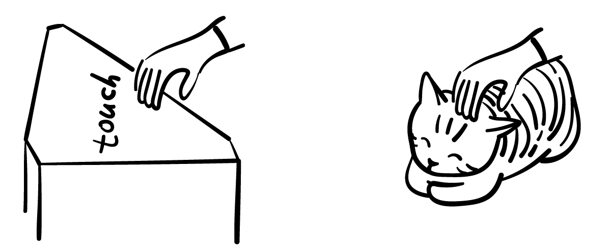
People would then discover they can join the show instead of being an audience. Several shimmering control points scattered around the tower would attract people to give a try. When they put their hands on top of the control points, they might see some units dazzling or becoming dull or have their colour changed or nothing happened. In case of nothing happened, they would try pressing a bit harder or operate a bit off the centre, then they would be rewarded by a striking flash running downside up. We were very into imagining these funny interactions. But they were just tools for Network Party, sociality among friends and even unacquainted strangers was the goal.
For us, well, time to go back to mundane reality: It was a tower that would be used twice.
After the first three months taking place in the department store mentioned before, the whole market would be moved to another store owned by the same company. Client strongly expected the installation to be easily dismantled, delivered, and reconstructed.
This market had several themes, one of them was eco-friendly. As the mark of a market grounded on eco-friendly philosophy, the tower, surely energy and material consuming, should respond to the call. Therefore, before knowing how the tower would attract eyes during the show, we worked out a recycling programme.
It seemed clear to us the tower should be constructed by small units. Comparing to a big tower, small units are far easier to be transported, although it would take some time to dismantle but it shouldn’t be hard. Small units have far larger potential to meet alternative needs. One unit would occupy as little space as a bed stand does, which doesn’t mean you cannot use several of them combined to decorate a larger area.

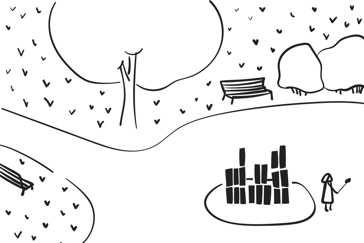
Every unit had to be well designed in two folds. One, it should look good in its barest situation, equally good as being in number. Two, future users could transform it with simple tools, removing a piece, adding a piece, a switch, a bulb, a cloth or whatever.
Inspired by the dancing triangular roofs around, we made our units triangular prisms, for the sake of load bearing and visual impact. Moreover, combining several prisms together, it doesn’t look repetitive. The appearance enjoys a constant changing while you are walking around it. The prism found itself sitting on a 600mm equilateral triangle.
How tall should they be? We knew they should be various. Three heights might be good and enough. In thinking of future adaption, we chose sitting height (400mm), table-top height (800mm), and table-top height for working in a standing position (1200mm).

We put all the initial ideas into a draft digital model and see what would Network Party say. They liked it and built thoughts on light around the volume and did some great renderings and packed everything greatly in a great presentation document and sent to the client. Client liked it too.
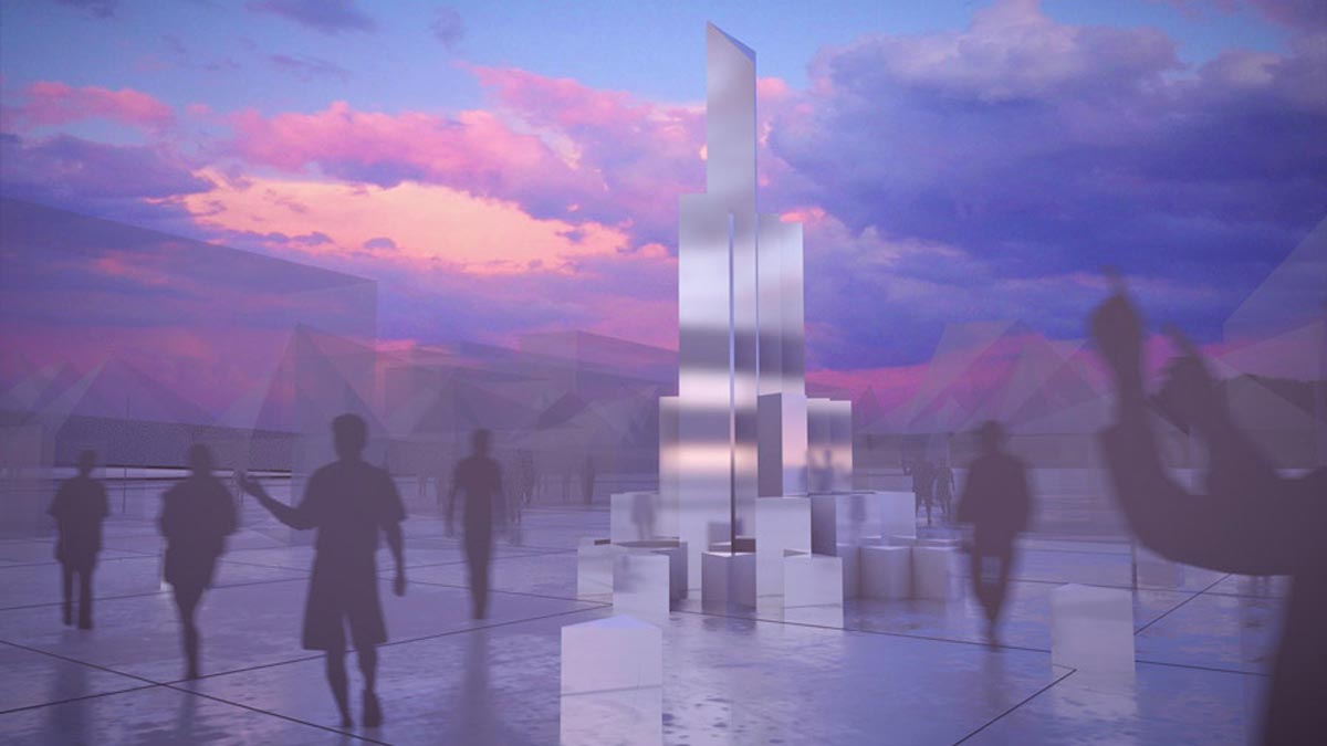
Afterwards, we put all the energy on making it real and real in a good way.
Make it real
As a tower, it has to reach a certain height, so people would think: it is a tower.
We tried to make it as high as possible within the budget. The initial idea was around 10m. Three-story tall might sound little to anybody with an architecture background, but not for Network Party. They had done a project higher than this before, but that was a standardised truss structure. This time, the height was just a bit lower but the structure was brand new. They worried a hell a lot for good reasons. We kept answering questions like “is that really stable, enough?” “There are plenty high-rise buildings nearby, wind is big therefore. please take this into account.” “Well, the frame…looks so thin…would it be too thin?” “Hey, in the middle where nobody can see, why not build a core…like a concert core?” etc..
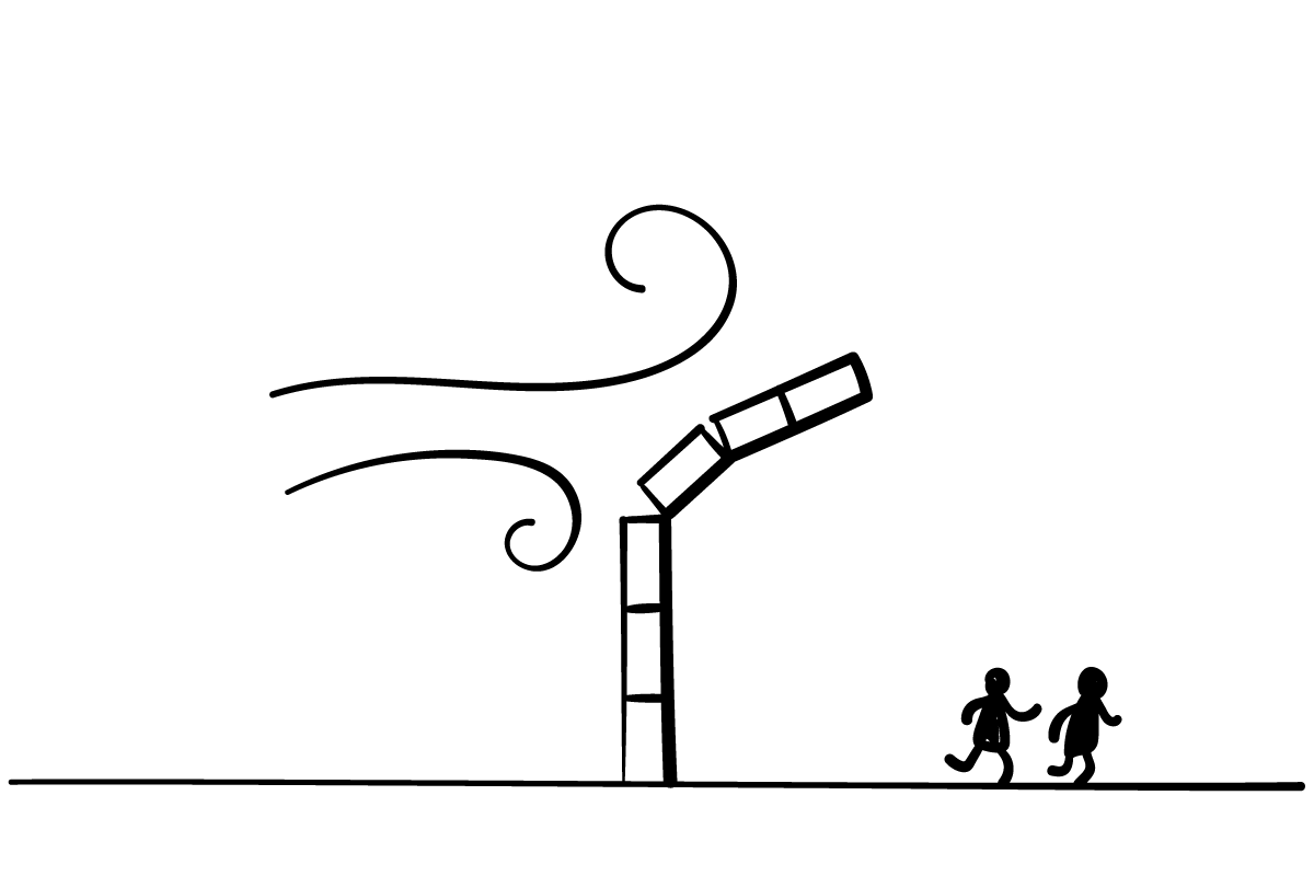
Our first back and forth was on cross section. All the frames were wood and with 30mm section. They worried it was not strong enough, too thin if it’s wood. We comforted them with triangle is naturally stable and of course, they knew. We asked them to see those skyscrapers with floor area shrinking when they climb up high, “our tower is similar to that, small head, big ass.” Feeling they were into the facts associated with small pieces, we asked them to zoom out a bit. See how the structure works as a whole, we said, it has solid frames and all the frames are solidly connected.
“How about 40mm?”
“30.”
“30 maybe is not so stable?”
“Not really.”
“You sure?”
“Well I think so. Let’s do 40 then.”
“Ok 30 is fine.”
Then we moved to the base. We had to keep the existing pavements intact, so it was impossible for the tower to take root. We thought is should be heavy enough to stand still but CK argued the base was too small to prevent the whole structure from being turned over by wind.
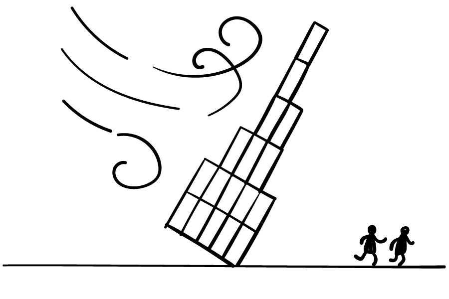
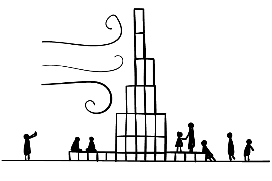
An enlarged base was added. It was big, flat, stage-like, with sitting height. Not just for grasping the ground, it enabled people to sit, lie down, crawl (baby only, if not living dead body), dance and gather for events. Besides, we felt it made the tower more influential to the area than before. One action, many benefits, good deal.
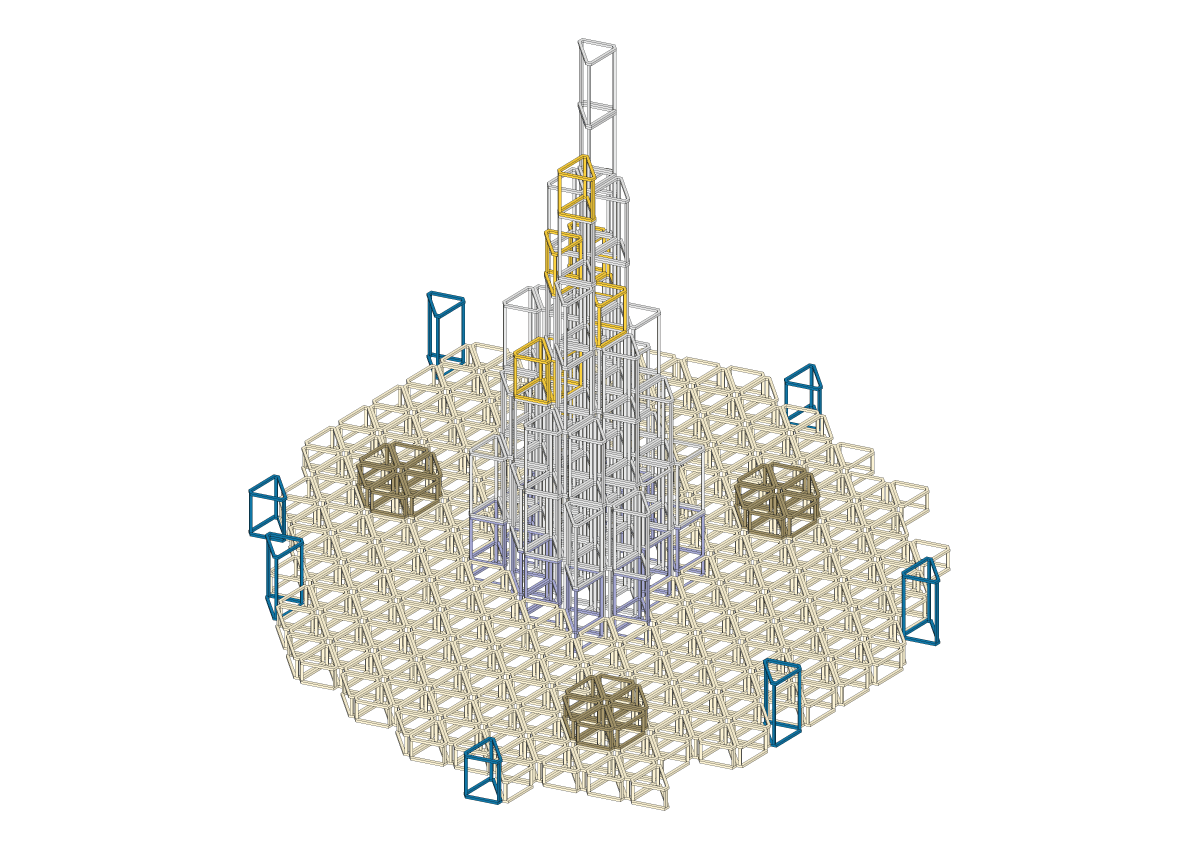
We spent no less time on construction and detailing.
The first thing to think was the facade. We went through a series of material tests and then judged by light effect and daytime looking. Far away from Wuhan, we couldn’t help so much on ordering samples and making mock ups. Network Party did them all, for several rounds. Once they got some results, they sent either pictures or videos to us and then we talked through things via Wechat.
Everybody agreed that light had to be homogenous. However, on the surface material, ideas went different. They favoured mirror like finishing, we thought polycarbonate board is good enough. They wanted something with attitude while we preferred to be modest here.
At last, we mixed both. From the testing video, we saw the lighting effect was unique and pleasant. The real surprise was the layering itself, a mixture of reflection and transmission, clear and foggy, cool and benign, a hard-to-tell looking. They also tested it with light off in natural light and with light on in darkness. It pleased everybody.
Then we tried to specify the layering. 2cm PC board was what we were after, but CK told we couldn’t do that. He did some maths based on quoted price given by the supplier, found we had to go with 1cm, for budget reason, sadly. 1cm was certainly far from good but budget was always a dictator. We knew we would get 1cm anyway, with or without arguing. Either we argue and finally apply the 1cm without thinking, or we gave up immediately and started to think the way of making it work. The later one was chosen.
So, now, we knew 1cm would deteriorate, schedule of construction would be rush, and CK warned us don’t overestimate builder’s ability and initiative. All of the above made us turn to shadow gaps, expecting it to cover the upcoming errors, as many as possible.
We heard about it from our architect friends in London, two years ago. If you don’t have enough money (people rarely do) to make components touch each other beautifully, they said, don’t let them touch, leave a shadow gap in between. If you follow a certain ratio between width and depth, the gap would be filled by the shadow the depth casts. Architects look for it to cover errors due to rushed schedule, unskilful hands or unqualified material or all of them combined. Sometimes people use it for its elegant and architectral appearance alone.
In the case of tower, we were able to create shadow gaps wherever we wanted. The tower was made by an array of components. In between components were all gap-making opportunities. Probably because of being too uncertain about the future, we made shadow gaps everywhere.
Network Party had been at odds with the gaps. We explained for a while, they understood and agreed on having them, but not as wide as this. The mess behind was their concern. Having only daytime condition in our mind, We were positive about the width, saying shadow could cover everything. It remained as a myth that nobody pointed out the mistake by simply saying look, during the night, light is from inside out, then all the mess will be out as well, there won’t be any shadow, only gaps. We realised it by their test on the mockup. More precisely, by looking at those octopus-sucker-like LED dots from the video they shot.
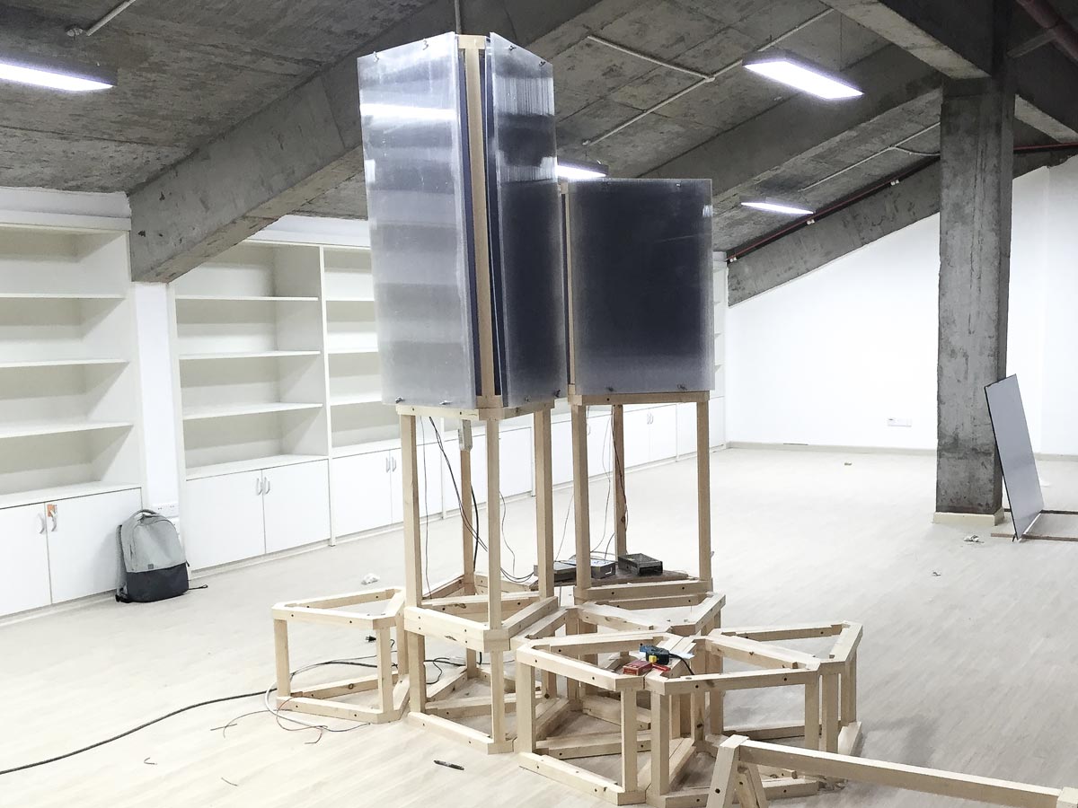
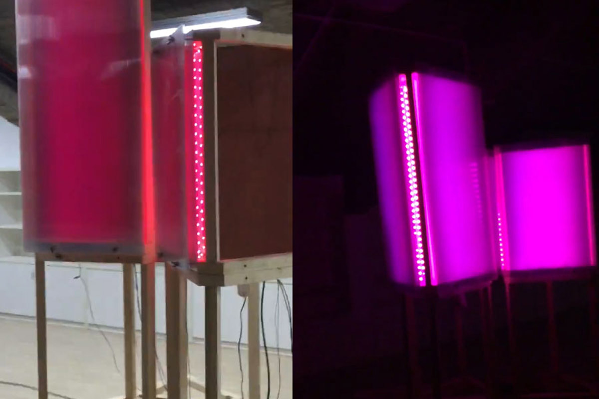
It was terrible, but our attention was soon distracted by a lethal functional problem being discovered at almost the same time. What if it rains and it rains a lot in spring Wuhan and water will sneak in and all the lights will die and no one can see any thing or mess anymore.
We asked shadow gaps for help, but received punches, one stronger than the other.
Fortunately, time was still enough for us to tackle down all the problems and the process of doing that got us some new details and lifted the general level of detailing up.
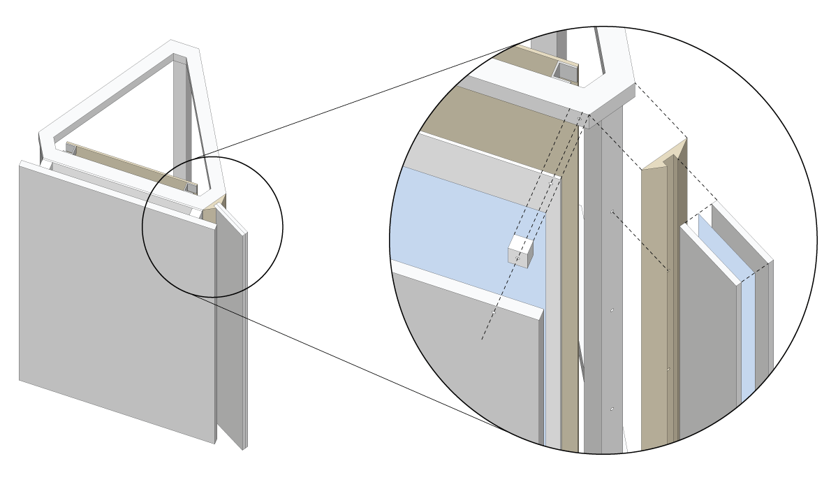
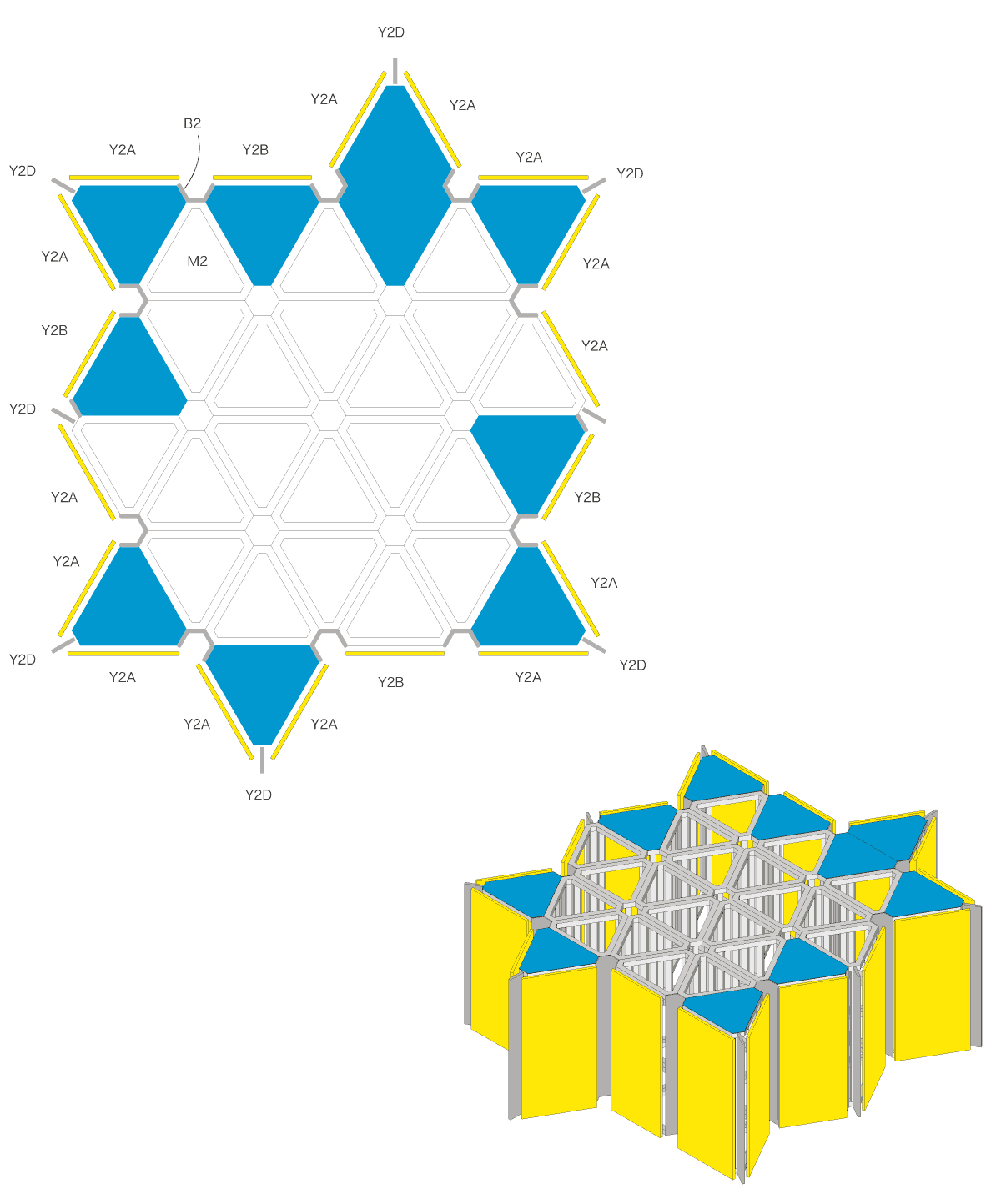
However, not every gap was sealed. From the picture below, you can see clearly all gaps between blue roofs and yellow panels were left open. First of all, it was OK for water go through here, for it wouldn’t touch LED lines or any other electrical components. Secondly, water stains on the backside of pc sheet might magnifying effect, making bad days’ light brighter than good days. It worked.
Into construction, site problems were not less, like constant rainy days, builder’s temper in redoing incorrectly done works, slippery base finishing and so on. Without Network Party’s effort on keeping an eye on site, pass information in time, and execute decisively, it is beyond our imagination that how we could get it done otherwise.
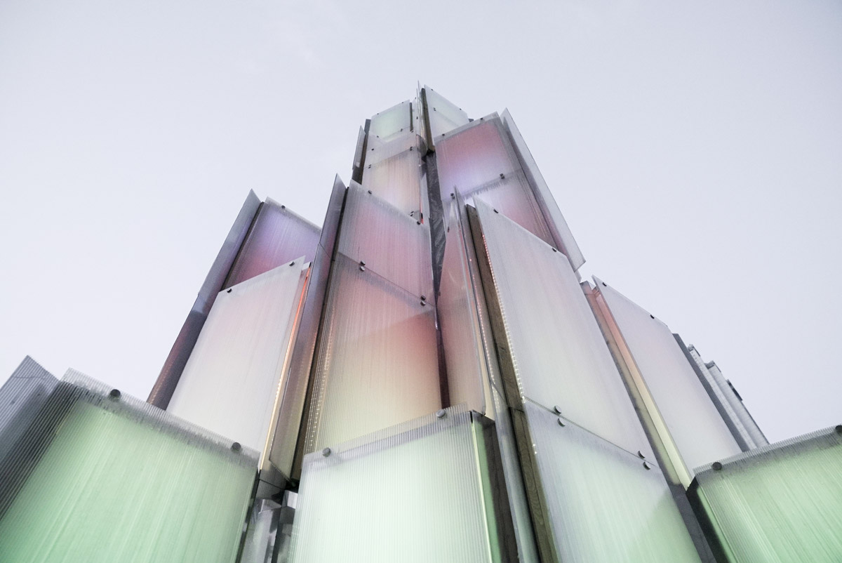
The Tower is another try of remote cooperation, an exceptional one on site-specific project. One thought is that distance may not be able to hinder cooperation anymore, as long as we have trust among us.
Below is the final video. It was made by Network Party, and depicts the whole construction process and how the tower excited people.
The tower quitted its role as a landmark last summer but the project has not yet finished. Network Party collected all the units after the tower being dismantled and now are sending them to their new homes in every corner of Wuhan, as planter, seat, table, closet, lamp and who knows what else.
